5 Ways to Improve Your CrossFit Website Design
I’ve been talking to a lot of CrossFit gym owners lately and was struck by how many are in the process of redesigning the website for their CrossFit gym.
One of the most important things to do is identify or confirm your key goals (don’t get distracted by the shiny things the developers are showing you until you do this). While your website is crucial for providing information to your members such as the Workout of the Day or upcoming events, more and more gyms are providing this to their members via social media.
The key thing people are wanting their website to do is to attract new members. With that in mind, here are the five keys things you need to consider:
- Create a Sales Funnel
- Build Trust
- Easy Website Navigation
- Search Engine Optimization
- Simple Mobile First Website Design
Create a Sales Funnel
The home page of the site should basically be a landing page with a great image that succinctly explains CrossFit to new people and how it can help them. It then provides a clear path to try your gym and learn more.

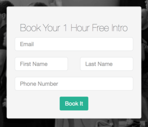
This will likely mean a sign up form that collects their name, email and phone number. Ideally, this would also allow them on the next page to book an Intro session. 321 Go Project nicely describes this as ‘two clicks to arrange an Intro’. A smaller version of this form should be placed strategically throughout the website.
You have to respond to these leads immediately or else they will go to another affiliate that gets back to them first. This could be done manually but there are a number of solutions out there (such as OnRamp … shameless plug, sorry) which can automate this for you so that these leads don’t fall through the cracks at any step of their onboarding.
For more information about creating a sales funnel for your gym check out this blog post.
Build Trust
Coaches

You need to introduce yourself and the rest of your coaches. Your credentials are important so make sure that you lay them out. A little bio about yourself is also good but don’t make it too long. Once you establish your credibility stop talking.
Having a picture of each coach is obvious but be different. Instead of just a headshot or them working out, show them working with members. This allows people to visualize themselves in that position.
Make sure that the Sign Up form is on this page as this may be the point that people decide they want to train with your gym.
Your CrossFit Community
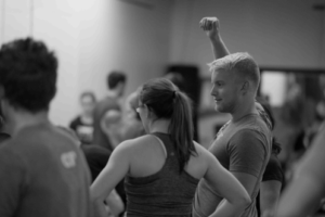
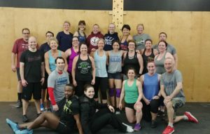
You also need to show how great your community is. You should have lots of pictures of your members (make sure that they agree to this … a release should be part of your new member waiver) throughout your site. Working out, recovering, charity events, competitions … all are good. Just make sure that you highlight them.

In addition to pictures, it is critical that you show social proof that people have gotten results with you. One of the best ways to do this is posting testimonials. I know it can be awkward asking but you have lots of people who would love to help.
We sent an email blast out to our members asking for a positive review on our Google My Business page. Not only did it boost our search ranking in Google (more on that further in this post) but it gave us a ton of great testimonials that we could use on our site etc. You can read how we did it for our gym CrossFit 782 here.
On a similar note, reviews on social media (such as Facebook) are another great option for building social proof as well as getting testimonials.
Easy Website Navigation
The structure of your website is based on your key goals and needs to be figured out early in any design or redesign process.
Don’t use unfamiliar terms
The overriding consideration is that the CrossFit site should be easy for someone who doesn’t know anything about CrossFit to find their way around your site. Instead of using terms like ‘WOD’ use the word ‘workout’. Navigation should be descriptive.
Don’t put it in the wrong place
Visitors expect to find menus across the top or down the left side. Putting your navigation in standard places makes your site easier to use.
Don’t have too many navigation items
You don’t want to confuse new visitors to your website. If you have 4 pages that could easily be put into one, do that. Visitors should not struggle to figure out what they should do next.
… and try to stay away from drop down menus. Usability studies have found that people think they are annoying.
Search Engine Optimization (‘SEO’)
While you can run paid ads to drive traffic to your site from search engines like Google and Bing, you also need to optimize your site so that you showing up on the top of the organic search results.
 You may think that there is no way I can rank ahead of Crossfit.com and other big gyms/blogs if someone searches for ‘crossfit’. However, most search engines now will search for local results on certain key words and put those at the top as they can be more relevant to their users.
Don’t get too concerned with keywords but focus instead on content. Google ranks good content higher than a site that is just keyword stuffing.
Google My Business
One of the best ways to boost your local SEO is with the Google My Business page.
First make sure it is filled out with current content, hours and pictures.
Second, get as many reviews on it as possible from your members. In this blog post I outlined how we moved up to the #1 spot for Google search results for ‘crossfit’ in our area by just asking our members to leave a review on our Google My Business page.
Workout of the Day
Listings of the WOD are a great way to build your reputation with search engines like Google and Bing especially if you add a little bit of content each day to describe the workout, goals, etc.
Simple ‘Mobile First’ Website Design
Mobile First
First, make sure your website is optimized for mobile devices first and desktop second. Why? Because these days most people are viewing your site on their phone.
 Whether you are doing this yourself (ie. putting together your own site using WordPress or Squarespace, etc. or getting someone to do it for you, it is really easy to miss this since the creation and review is often done on a desktop.
While most website platforms are ‘responsive’ and will automatically change the layout for mobile devices, some key elements may not work, be off to the side, etc. so that mobile users cannot see the submit button on a form or blocks of text may be in the wrong order.
Less is More
The other design consideration is to make sure you are using a good amount of white space. Resist the urge to cram too much on to the web page.
Similarly, resist the urge to write too much text … good copy takes longer to write but it will be much easier for visitors to your site to read.
Be Genuine
Choose some great pics of your gym, your community and your coaches but don’t be too stylish (a more natural set of pictures is way better than something that looks overproduced) … and for the love of everything holy, don’t ever use stock photos.
By the way, if you have nice bathrooms/change areas show those. While some may not care, for some people that is the key differentiator in deciding which of the gyms in your area to join.
Be genuine in your copy … use your voice. If someone writes the text (aka copy) for your website, make sure you go back and put it into your words. You want to attract people like you so use your own words and not someone else’s.
Bonus: The Hero’s Journey


In closing, try to tell a story. A great way to approach writing your content is to consider a standard formula for almost any movie, the Hero’s Journey. There is a hero and there is a guide who helps them reach their goal … here is the key part: you are not the hero, your member is.
You are the guide so don’t focus on what you have done (apart from the credentials mentioned above) but instead focus on how you can help them.
Want more free content PLUS community?

Join our Gym Marketing FB Group for content and discussions with other gym owners here.
Categories
- Automation (4)
- Facebook Marketing (4)
- SEO (2)
- Tips & tricks (2)
- Uncategorized (14)

